Maths Police Christmas Special
In which @reflectivemaths and I find out which graphs have been naughty and nice. Hint: none of them are nice.
Constable Gale blew a party streamer and I shot him a steely glare.
“Are you hanging up your stockings on the waaaalll?” he crooned.
“No, Gale. I am decidedly not hanging up my stockings on the waaaalll. Neither am I rocking around the Christmas tree, nor building a snowman in the meadow and pretending he is Parson Brown.” I took a sip of the mulled wine, spat it out, and poured myself some coffee. “On the contrary. I am, since the Maths Police never sleeps and I’ve drawn the double short straw of a Christmas day shift with YOU!, I am compiling and cross-referencing a catalogue of recent crimes against mathematics.”
“So you’re making a list and checking it twice?”
“You know, dark red really suits you, Gale.”
“I’m not wearing dark red,” he said, just as the contents of my mulled wine sloshed satisfyingly across his uniform.
“Never mind that,” I said. “What about this sudden outbreak of terrible bar graphs? Look at this:”
RT this graphic to support our long-term plan to fix the economy and help hardworking people. pic.twitter.com/CkCxXZQifZ
— Conservatives (@Conservatives) December 3, 2013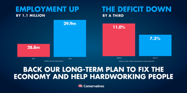
“They’ve made a 4% rise in employment look like a 200% rise? That’s ballsy.”
“And the deficit - they’re really using that graph to show a second derivative - as in ‘we’re losing a bit less money than we were.’”
“These Conservatives… do they have a record for this sort of thing?”
“Funny you should ask, Gale. Funny you should ask. Here’s a graphic shared by Councillor Iain Lindley:

“Yikes! That looks like an 80% drop, when it’s really about 13%.”
“Their coalition partners are at it, too:”
"..the total number of people in #employment is now at a record high" @GregMulholland1 http://t.co/0VGDeFFaYY #jobs pic.twitter.com/dPFVTou3QU
— Liberal Democrats (@LibDems) November 13, 2013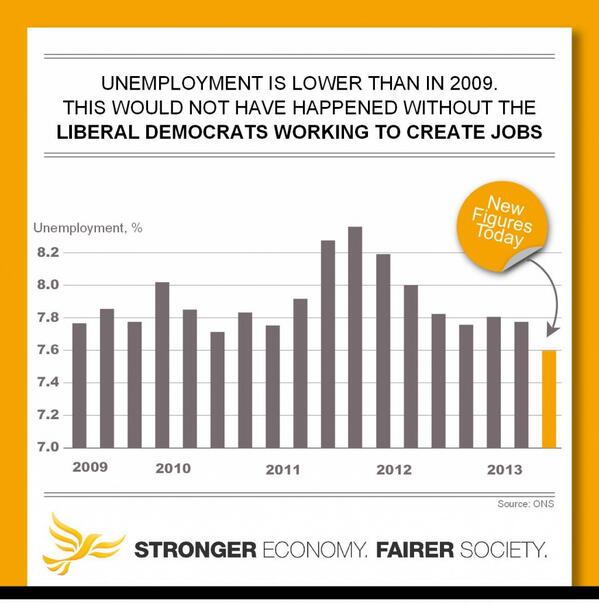 “That’s an 8 or 9 per cent drop that looks like more than 50%.”
“Yep - they sure talk a lot about the bottom line for people who don’t understand where it ought to go.”
“Ho ho ho,” said Gale, dryly.
“This Lindley chap’s blog is a masterclass in misleading graphs, by the way - you should check it out some time.”
“I may have to turn a blind eye. It’s Christmas, after all.”
I offered him a sweet. “Humbug?”
“I prefer shortbread, personally.”
“Speaking of which, our friends in the north have sent us this:”
@icecolbeveridge One visualisation looks ok, this is surely a bit off tho? pic.twitter.com/nczgXsRPMA
— James (@jarofgreen) December 3, 2013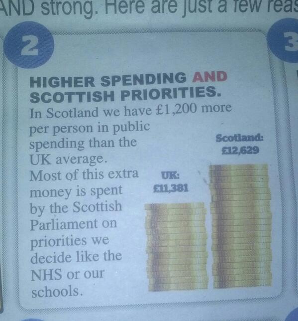
“That’s not so bad, is it?”
“It’s not as bad - about a 10% increase, looking like 50%,” I said.
“Where’s that from?”
“It’s from a Better Together newsletter.”
“And Better Together is run by the Conservatives!” Things were starting to fall together for Gale.
“In part, at least. But Labour has previous on this front, too - look at the second-to-last case, I’m sure it’s not just the Tories.”
“What are we going to do with them?” asked Gale.
I thought for a moment, and my face must have contorted.
“You’re still cross that nobody believed Andrew Mitchell called you a pleb, aren’t you?”
“No,” I lied. “Listen, I’ve got it. You know you have that cell with Wizzard in?”
“You’re not suggesting we make them share a cell with people yelling ‘I wish it could be Christmas every day’, are you? That would go up against all sorts of human rights legislation.”
“Lucky,” I said, “that they don’t believe in that sort of thing, isn’t it?”
* Thanks to [twit handle = ‘jarofgreen’], [twit handle = ‘robyn_hud’] and [twit handle = ‘cllrtrisosborne’] for tweeting the maths police hotline.
* If you’ve seen a dodgy graph, do please tweet it to [twit handle = ‘icecolbeveridge’] with the hashtag #mathspolice - we’ll investigate, as soon as Constable Gale has dry-cleaned his uniform.
* The Maths Police is politically neutral. Even though this post is largely haranguing Conservative advertising (because those were the graphs we’ve come across), we’ll gladly bad graphs from all political parties - and from outside of politics.